The universal focus state
Posted onDesigning a focus state? A focus state that works on every background is a great starting point. Understand how it works, and improve it for your use-case!
- What is a focus state?
- Why is the focus state important?
- What's the problem?
- What's the solution?
- Introducing the oreo-focus
- Show me how
- Show me the code
- Notes
What is a focus state?
A lot of people use keyboards to navigate websites and apps. With a keyboard you can move (virtually) from one interactive element (like a link or button) to another. These interactive elements become "focussed". Only one element can be focussed (or "have the focus") at the same time. The foccused elemtent is pretty much your location on a page. And just like with your physical location, you can only be in one place at the same time (sadly).
The element that has the focus is your location, but also where keyboard input goes. A practical example is a text field. When a text field has focus and you start typing, your input appears in the text field. It will also accept pasted input. And when your focus is on a link or a button, you can activate it. This will trigger an action on the page or navigate you to another page.
To visually clarify what element has the focus, it's supposed to have a so-called "focus state". You might also encounter the terms "focus indicator" or "focus ring" instead of "focus state". I picked "focus state" because it's a clear term for designers. An element like a link often has multiple designed states (and combinations of states) like a focus state, an active state, a hover state and a visited state.
Browsers come with default focus states. You might have seen a blue ring around an element before, or a thin dotted outline.
Why is the focus state important?
The issue is found partially in the last sentence: "you might have seen". Focus states are not always very clear or visible. Imagine browsing the web on a desktop or laptop, without seeing your cursor. That's a bit what it's like to not have a clear focus state. You have no idea where you are!
It's very important for a user to be able to find out where they are on a page. Just like it's essential to know where your mouse cursor is. Just like how many physical maps feature a big arrow stating "you are here". You don't want to feel lost.
If there's no clear focus state, you're basically telling a lot of people you don't care about them. You don't care if they do or don't know where they are. You're excluding them. And that's why it's an accessibility issue as well. Not all people who use keyboards (or devices that work like a keyboard) have an option to use something else. They might not be able to.
What's the problem?
The problem is (not surprisingly maybe) that the focus state is not always visible. Sometimes there's a default focus state that doesn't work well, sometimes there's a custom designed focus state that's hard to see or the worst case: there's no focus state at all.
I'm not kidding here. Some websites remove the focus state entirely. For example because it's "ugly". I prefer inclusion over looks. And often it's not one or the other. A good designer can do both. (Question on the side: are you a good designer if you can't design something inclusive?)
So let's start with a big: Don't do this! Don't give your elements an "outline: 0". When you remove the outline, you remove the default focus styles and you might exclude people.
What's the solution?
A possible solution is a custom focus state that works everywhere on your app/website with all interactive elements. This can be quite a challenge. Does it work on both dark and light backgrounds? Does it work with dark-mode? Does it work with interactive elements of all kinds and colours? Quite a few questions pop up, and quite a few testing scenario's need to be covered to ensure a quality focus state
Introducing the oreo-focus
Another solution I'd like to offer is a universal focus state. One that works in all situations and is usable anywhere. Even if you do want to design your own custom focus state, maybe it's nice to start from something that you know works. You have a solid starting point to work from.
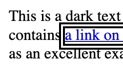
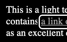
Let start with the most basic unstyled situation. Your link is blue on a white background. What gives the best contrast on a white background? Black. That's the starting point for our focus state.
But Erik, haven't you heard about dark mode? What if the background is dark or black? Good point. A black outline on a black background doesn't really give the contrast you'd like. So we add another layer to the focus state. What gives the best contrast on a black background? White. We now have an outline that's black on the inside, and another white layer around that. Wow!
It works for white backgrounds. It works for black backgrounds. Redundant approaches rock!
But Erik.... what if you have a black button on a white background? Right. Then we'd add black to black, and then white while surrounding it with white. Is everybody still following this? Let's fix this once and for all. We'll add another outline! The oreo-focus is complete!

It works with light, dark and whatever combination. I can prove this by going through a pile of test cases. This blog has been a draft on my laptop for over 4 months though. I think that shows that I can go through it, but I won't.
Show me how
It's simple (famous last words). There are 3 lines of CSS, and the third is optional.
:focus {
  outline: .375rem double black;
  box-shadow: 0 0 0 .25rem white;
  border-radius: .125rem;
}
First we select the focus state with :focus. We add a double outline that's black with outline: .375rem double black;. This is the "inner" and "outer" outline. You can read more about this outline-style on MDN.
But we want a white outline in there as well. We can add that with a box-shadow: box-shadow: 0 0 0 .25rem white;. And to make everything pretty, you can even add a border-radius: border-radius: .125rem;. Pretty right?
Show me the code
You can find the code, with examples, here: https://codepen.io/erikkroes/pen/OJEOWPN. You can go through all the test cases that I didn't. It should even work with Windows High Contrast Mode (WHCM).
Enjoy!
Notes
This whole idea and subject came up on the web-a11y slack. Throw me a message on whatever platform for an invite. I merely executed the thing and now I'm writing about it.
Further read on focus states on how they can/should be styled can be found here:
- WCAG SC 2.4.7 Focus Visible
- WCAG SC 1.4.11 Non-text Contrast
- Sara Soueidan on Focus Indicators
- Native form elements
Got feedback? I bet you'd appreciate a group of accessibility experts. Share insights and grow together.
Join Discord!