emphasis
Posted on😬 This trend is just so counterintuitive.
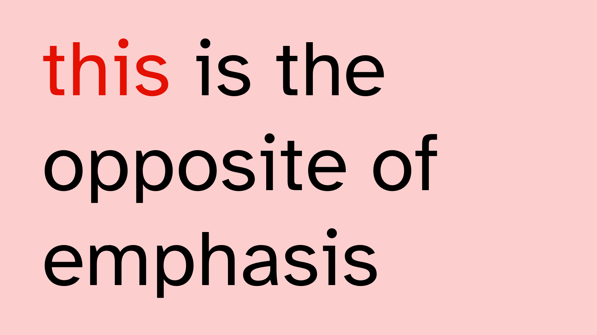
If you want to emphasise something, why do you -lower- the contrast?
I see this way too often. Also in states of ui components for example. If something becomes -more- important, -increase- the contrast.
🧠 Or at least don't lower it.